Let’s be honest: logos are everywhere. From the moment you grab your morning coffee (hello, mermaid logo!) to the apps you scroll mindlessly before bed, logos are constantly in your face. And yet, not all logos stick. Some fade into the background faster than a trend on TikTok, while others—well, they leave a mark. That’s the magic behind The Anatomy of a Great Logo: understanding what works, what doesn’t, and why it matters.
Let’s break it down.
A great logo isn’t born from thin air; it’s built with intention. Think of it like a well-tuned machine—each piece serves a purpose. Here are the key ingredients:
A great logo starts with simplicity. It’s about knowing what to leave out just as much as what to include.
Take Nike, for example. It’s a swoosh. One single, elegant stroke that screams movement and speed. It doesn’t need 12 gradients, a 3D effect, or Comic Sans to make you feel something. (Side note: Please, for the love of all things design, never use Comic Sans in a logo.)
❗️Why it matters: Simplicity makes your logo easy to recognize and remember. Think of it like a good one-liner—straight to the point and impossible to forget.
Okay, not in a creepy way, but you get the point. A memorable logo lingers in your brain like that song you can’t stop humming.
Think of the Apple logo. Is it flashy? Nope. But it’s iconic because it’s clean, clever, and instantly recognizable. The bite in the apple? Genius. It’s a tiny detail that elevates the design from “meh” to “memorable.”
❗️Pro tip: Ask yourself, “Would someone be able to draw my logo from memory?” If the answer is no, back to the drawing board you go.
A great logo needs to look good everywhere. I’m talking about business cards, websites, T-shirts, billboards—you name it. This is where versatility comes in.
Case in point: Coca-Cola. That classic red script looks just as good on a neon sign as it does on a soda can. It doesn’t need fancy effects or gimmicks to work across platforms.
❗️Quick test: Shrink your logo down to the size of a postage stamp and blow it up to billboard proportions. Does it still look great? If not, it’s time to simplify.
Your logo should reflect your brand’s personality and values. If your company is all about sustainability, maybe skip the futuristic metallic vibes. And if you’re a tech startup, probably don’t use a serif font straight out of a 19th-century book.
Let’s look at Airbnb. Their logo—the “Bélo”—is modern, friendly, and inclusive, perfectly mirroring their mission of “belonging.” It’s not just pretty; it means something.
❗️Pro tip: When designing a logo, start by asking: “What story does this tell about my brand?”
Learn more about the Airbnb Rebrand here: Airbnb’s consistent rebrand focuses on the sense of belonging to a community
Design trends come and go faster than you can say “Y2K aesthetic.” But a great logo? It’s timeless.
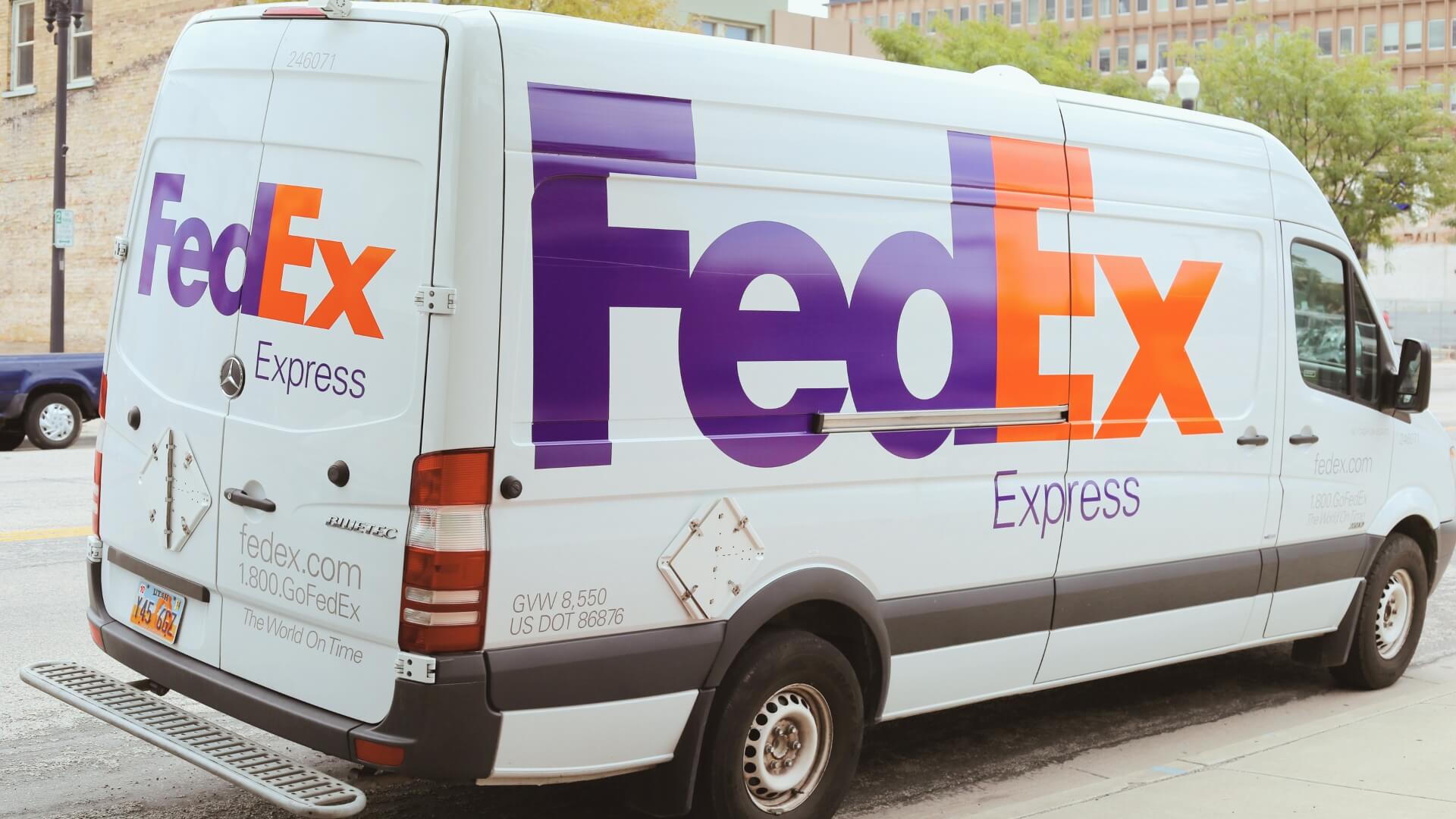
Look at the FedEx logo. It’s been around since 1994, and it’s still brilliant. (Have you noticed the arrow hidden between the “E” and “x”? Go ahead, I’ll wait.) It doesn’t rely on gimmicks or trends, so it’s still relevant decades later.
❗️The takeaway: Avoid designing a logo that screams “2025!” unless you want to rebrand in five years. Aim for a design that will age gracefully.
The best logos often have a little surprise tucked in—a clever detail that makes you smile once you notice it.
Amazon’s logo is a great example. At first glance, it’s just the company name with a swooping arrow. But wait—look closer. The arrow goes from “A” to “Z,” subtly reinforcing their promise to sell everything under the sun.
Adding a small “aha!” moment can elevate your logo from “just fine” to brilliant.
Designing a great logo isn’t rocket science, but it’s not a walk in the park, either. You’re aiming for that sweet spot where simplicity, memorability, versatility, relevance, and timelessness all come together in perfect harmony.
And if you’re feeling stuck? Don’t sweat it. Sometimes, the best ideas come from stepping away and letting inspiration hit you while folding laundry—or, you know, in the shower. 🚿
Need help creating a logo that truly represents your brand? Whether you’re starting fresh or rethinking your current design, I’m here to make the process seamless and impactful. Let’s create something that feels authentically you. Connect with me today!