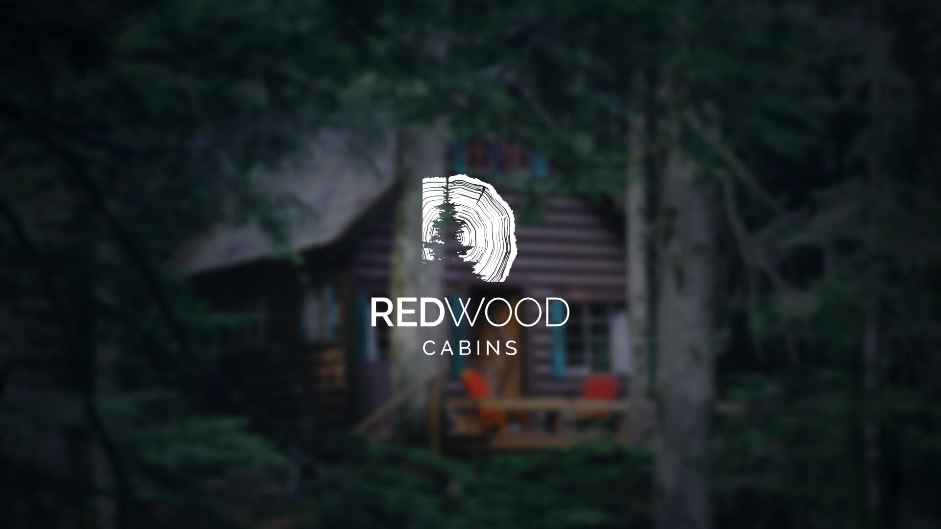
Redwood Cabins was established in 2002 as a rental service located in northern British Columbia. It has since grown to be a full-service booking platform for cabin rentals across Western Canada. The accommodations range from pet-friendly or eco-friendly cabins to shabby-chic glamping retreats—perfect for any family vacation or romantic getaway.
Having experienced tremendous growth over the last couple of years, the client decided it was time the Redwood Cabins brand received a refresh to mirror its recent success.
This trending cabin rental agency is the perfect blend of shabby-chic-accommodation meets rugged-Canadian wilderness. The cabin rental agency required a confident, modern, and adventurous rebrand to portray this unique style.
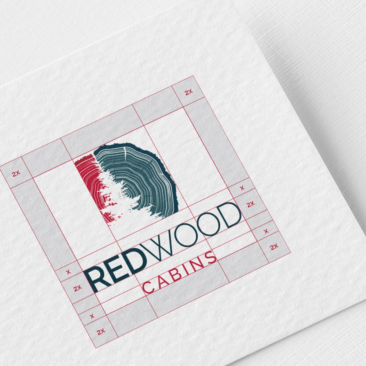
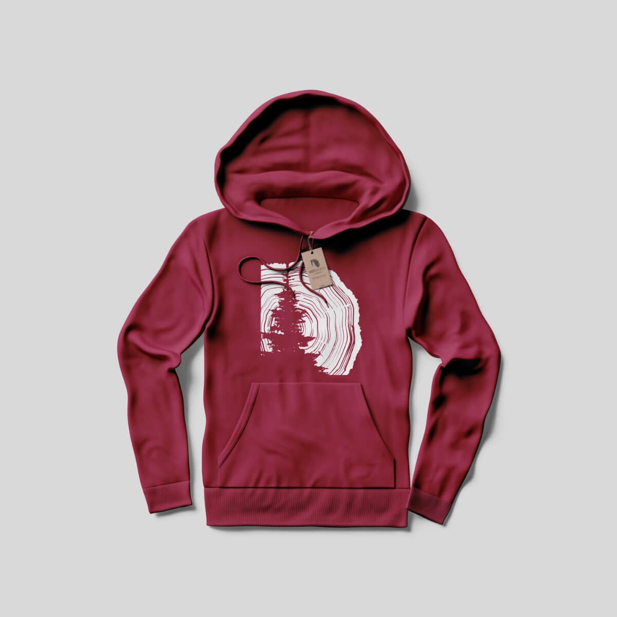
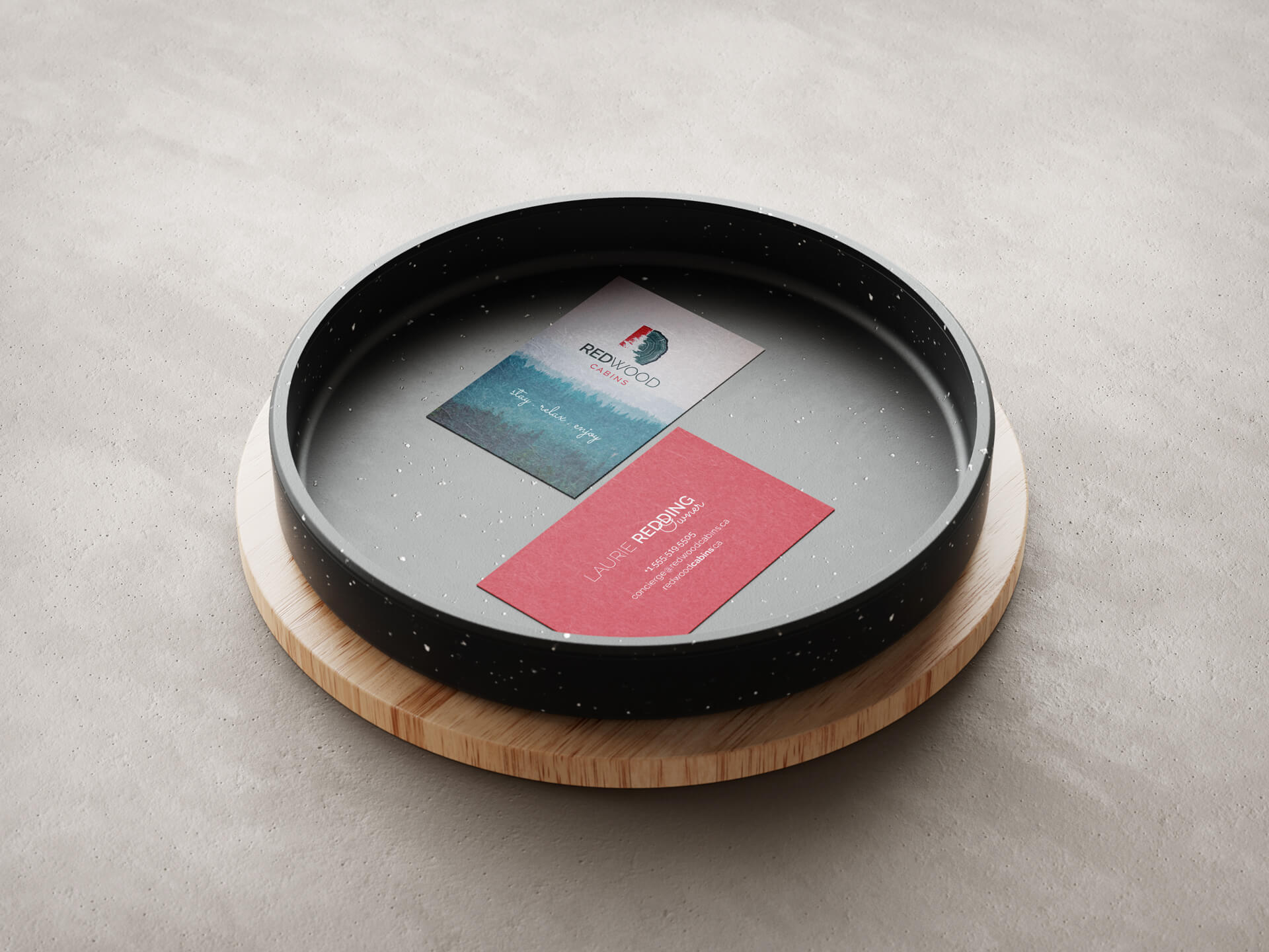
I wanted to illustrate a simple complexity in the new logo that captured the Canadian wilderness. I did so by taking advantage of the silhouette of a pine tree and the lines of a tree trunk for the logo mark. The main typography chosen for the new design is Raleway – an elegant sans-serif typeface family. The Sacramento typeface is also used (with discretion) as an accent font, as it has a commanding presence for headlines and titles and stands on a thin line between formal and casual lettering styles, making it that perfect shabby-chic blend. For the colour palette, a vibrant burnt red and deep wilderness blue were selected. Blue to represent the brand’s friendly and comforting nature, and red to represent the adventurous side.
My role in the project – Brand Strategy, Project Management, Art Direction, Graphic Design