Since 1989, the Organization for Literacy in Lambton has been a non-profit dedicated to providing residents of Lambton County with free programs and services that support skill development in basic math, reading, writing, and computer skills.
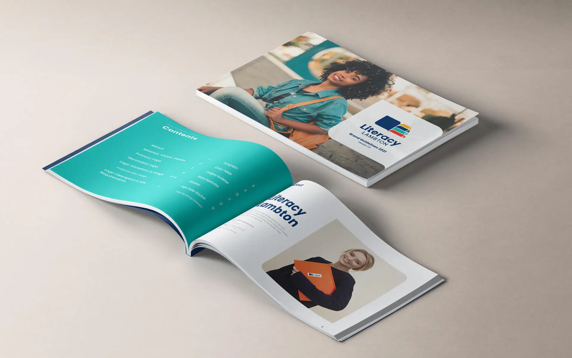
Literacy Lambton sought a brand refresh that was vibrant and adaptable, featuring elements that could work across various applications. The client envisioned a brand that was bright, visually engaging, and reflected a positive learning environment.
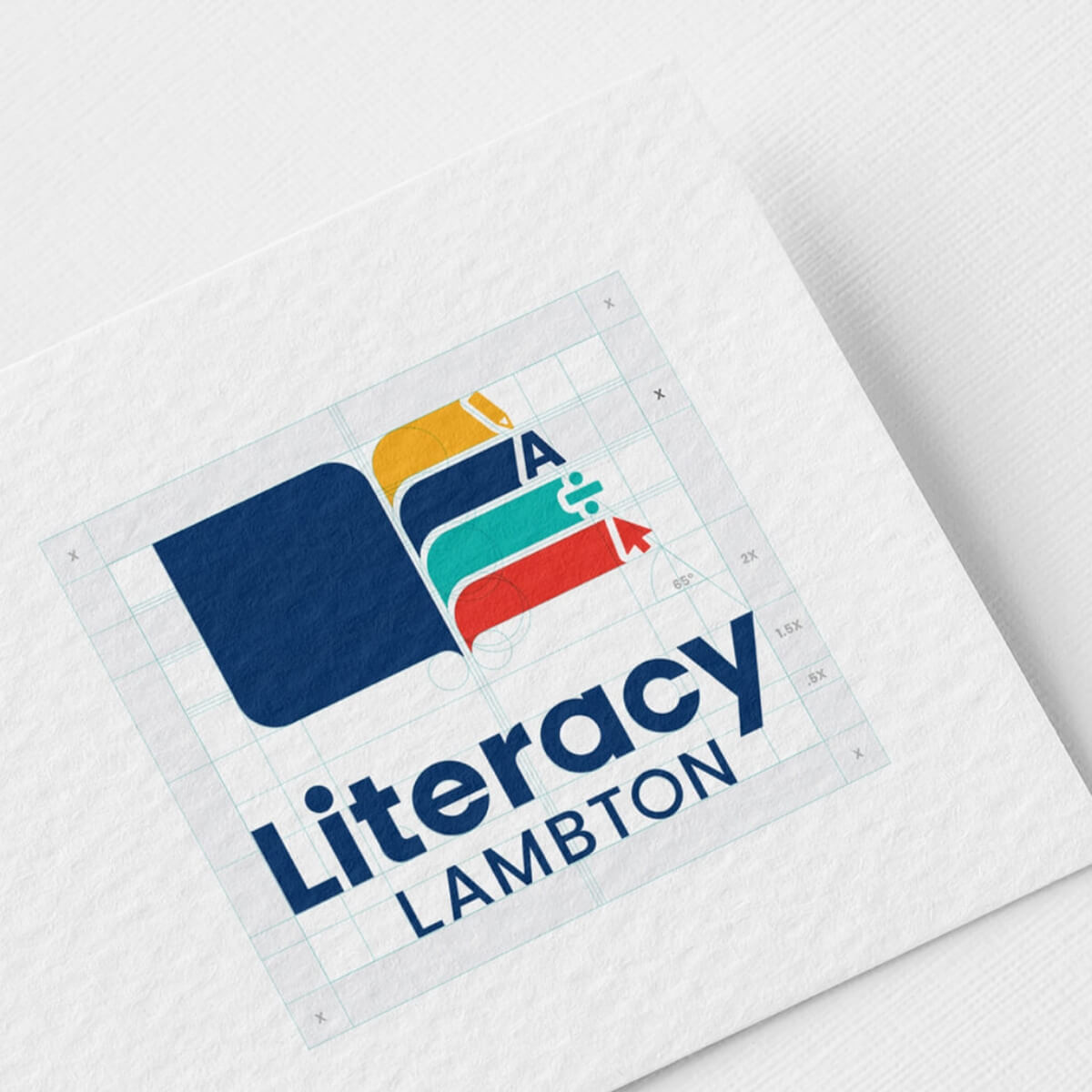
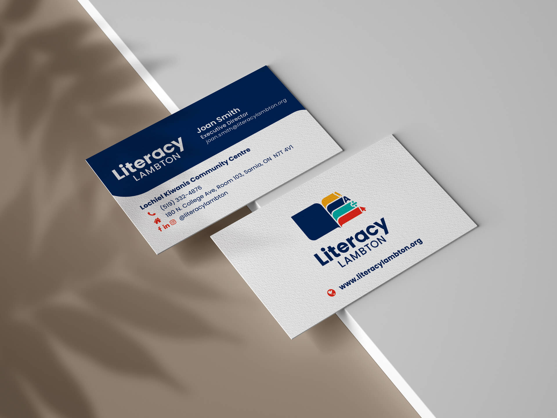
The result: The new Literacy Lambton logo features two primary elements—the book icon, symbolizing knowledge and growth, and a wordmark that conveys stability and support. The color palette reflects the foundational courses offered by the organization, and the clean, dyslexia-friendly typeface enhances readability. Together, these elements create a brand that feels approachable, nurturing, and above all, trustworthy.